Summer is definitely here, and with the hot weather comes the perfect opportunity to give your home a fresh new look. Refreshing your interior design can be as simple as swapping out some old decor for something new, but where do you even start?
As Tidy Home Guide reports, from cool pastel colors that evoke feelings of serenity and calmness to creative DIY projects made from repurposed materials, there are countless ways to breathe new life into your living space.
You can beat the heat in style by incorporating refreshing color schemes into your summer decor. Think cool blues, soft greens, and creamy whites to instantly brighten up your space.
Cool Pastels: A Calming Influence
When it comes to beating the heat this summer, creating a calming atmosphere at home is essential. And what better way to do that than with cool pastel colors? These soft, serene hues have a soothing effect on our senses, making them perfect for hot summer days.
Some popular cool pastel color combinations include pale pink and baby blue, or mint green and powder purple. To incorporate these calming shades into your decor, try painting one accent wall in a light pastel hue or adding throw pillows and blankets in soft pastel tones to your furniture.
You can also use cool pastels as a backdrop for other summer-inspired elements like natural textures, wicker baskets, and vintage seashells. For example, pair pale pink walls with a natural jute rug and woven basket storage to create a relaxing retreat that feels like a beachy escape.
Remember, the key is to balance your cool pastel colors with neutral whites or creams to prevent the space from feeling too sweet or overwhelming. With these simple tips, you can easily create a cooling oasis in your home that’s perfect for hot summer days.
Neutral Tones: Timeless Elegance
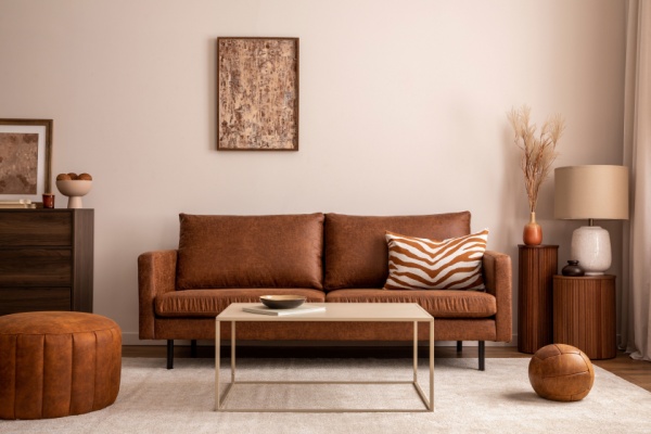
When it comes to creating a refreshing and elegant summer home decor, neutral tones are an excellent choice. Not only do they provide a clean and calm backdrop for your summer decor, but they also allow you to easily incorporate pops of color through accessories.
To choose the right shades, consider the natural light in your space. Lighter neutrals like cream, beige, or pale gray can help reflect sunlight and make rooms feel brighter and more airy. On the other hand, deeper neutrals such as taupe or soft brown can add warmth and coziness to spaces with limited natural light.
For a stylish way to incorporate neutrals, try using monochromatic schemes by selecting different shades of the same neutral tone for walls, furniture, and accents. For example, you could paint your walls a soft gray, use gray sectional sofas, and add gray and white patterned throw pillows for a cohesive look. Alternatively, mix in subtle patterns like textured wallpaper or natural fiber rugs to add depth and visual interest without overwhelming the space.
—
Photo Credit: Followtheflow / Shutterstock.com
