After reviewing several 2020 lists, here are a half a dozen looks ready to go the way of the floppy disk, along with what designers suggest you try instead.
OUT: Farmhouse, cottage, nautical and rustic-modern looks. These styles are so last decade, according to designers at Living Spaces, a California-based furniture retailer, and Fixr, an online resource for home remodelers.
“People liked these rustic, shabby looks at first because you don’t have to work hard to maintain them,” say Fixr interior design expert Sarabeth Asaff South, “but the look can be a little too worn. Homeowners are finding there’s a fine line between comfortable and rundown.”
Instead, South suggests trying the cleaner lines of mid-century modern styles.
BUT, farmhouse, cottage, nautical and rustic looks are always in style if you have a farmhouse, cottage, beach house or rustic cabin. Anywhere else they look contrived. Design for where you live.
OUT: Mason jars and pallet art. As the farmhouse and cottage looks wind down, they’re taking mason jars and pallet art — artwork on recycled wood — with them, according to Living Spaces’ 2020 home décor trend report, based on data from Google Trends. Interest in mason jars has fallen 40 percent since its 2015 peak; and pallet art interest has dropped 56 percent from its 2015 high.
Instead, move toward minimal with cleaner-lined cylinder vases, and art that shows a lot of canvas and puts the emphasis on negative space.
(That said, a bouquet of daisies in a mason jar on the kitchen table always look lovely.)
OUT: Rose gold. The metal’s pink undertones limit how and where you can use it, say Living Spaces experts. Plus, if you get a rose-gold faucet and a rose-gold light fixture from different makers, the finishes likely won’t match, South says.
Instead, “people are swinging back to chrome,” South says. “Chrome is easy to clean, impervious to most household chemicals and surprisingly durable. Plus chrome always matches.”
OUT: Gray. After a long ride, gray is finally fading. In a recent survey, Fixr found that 80 percent of designers said gray was either completely over or waning. According to Elle Décor, restrained, monochromatic gray-on-gray interiors are passé. However, South adds, the lag between what designers say and what homeowners do can be two to three years.
Instead, move toward warm, brownish grays or go for a warm palette. Note: Earth tones are making a comeback.
OUT: Ikats and chevrons. Since interest in Ikat patterns peaked in 2015, it has dropped 66 percent; since interest in chevron patterns peaked in 2014, it has dropped 73 percent, according to the Living Spaces report. Consumers liked the softer edges and welcomed the retro and global feel, but the data say, we’re over them.
Instead, try bolder geometrics, which have been trending up for several years. And when you see a fabric fad — remember the dragonfly motif? — get it in a hot pad, not a chair.
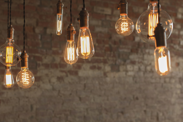
OUT: Edison bulbs. Those lightbulbs that boldly show their filament have dropped in interest 43 percent since 2016. “The exposed lightbulb trend was popular for a hot minute,” say Living Spaces designers, probably because of their “authentic vintage charm.”
Instead, designers suggest keeping the simplistic, no-lampshade charm of Edison bulbs by opting for the “no-shade” shade — lampshades made of see-though materials that let you see the bulb inside, but not quite so clear.”
—
Photo Credit: Ezume Images / Shutterstock.com
