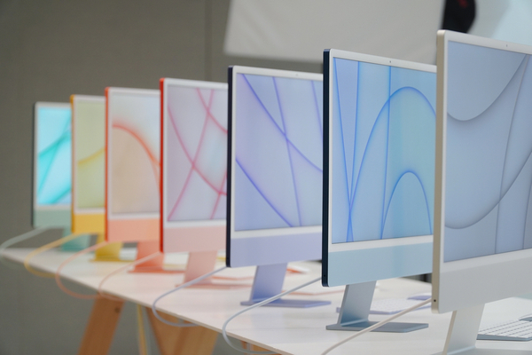
Over the past several weeks, Apple has held a couple of major events and introduced major redesigns on most of its products, both large and small. One of the things people have been noticing is the veritable rainbow of colors and light screen borders. Not that people are complaining, exactly, but the inquiring consumer mind is just wondering, “why?”
Case in point: when Apple unveiled the radically redesigned 24-inch iMac in April in that broad range of colors, some observers winced at the white screen borders (Apple calls them “light gray”) and wondered why Apple hadn’t extended the vibrant color scheme to the edges of the display, or at least used black for the bezels instead. “The borders are meant to complement the typical home design, for one, and blend into the background,” Colleen Novielli, Apple’s head of product and marketing, later explained in an interview. “The lack of the stark contrast provides a more seamless experience for the user.”
Pitched in this way, Apple was claiming that black bezels would have provided too much contrast against most home decor, but it was also suggesting something else: White borders are there for casual Mac users, a.k.a the consumer segment most likely to appreciate iMac colors designed “to bring a sense of brightness, optimism, and joy.” Office workers in brightly lit environments are also likely to warm to the same design attributes, while using apps with white backgrounds such as spreadsheets and word processors, which pair well with the light gray bezels.
Apple is essentially saying black borders are better suited to creative professionals – video editors and photographers who tend to work in darker environments, for example. And we don’t need to wait for Apple’s redesigned larger iMac to see if it has black bezels to prove this theory. Apple has already said the black notch and borders on the new MacBook Pros “look great in dark mode, which our pro users love.”
Additionally, leaker Jon Prosser claimed back in May that Apple’s upcoming redesign of the MacBook Air will be available in a similar array of colors, similar to the current 24-inch iMac. Since then other reputable leakers and analysists have made the same assertion. It’s easy to imagine Apple likewise claiming a white notch and bezels look “great” in light mode, but the current 24-inch iMac gives us another reason to believe the redesigned MacBook Air is likely to have off-white elements.
On another, kind of “retro” level, the new range of rainbow colors is also a throwback to the “good old days.” When Apple revealed that the 24-inch iMac would be available in a range of fun colors, many were quick to note the similarity it bears to the original 1998 all-in-one desktop, the iMac G3, which was offered in several colors and paired with a light gray bezel.
Instantly recognizable thanks to its iconic rounded design amidst an ocean of boxy beige desktop PCs and monitors, the iMac G3 was loved by consumers and quickly became the best-selling computer on the market at the time. Apple followed the original iMac in 1999 with the iBook G3, which continued the theme of combining color and light gray plastic, and added an off-white keyboard to boot. The iBook was essentially the portable version of the iMac. In ads, Apple even used the slogan “iMac to go. Introducing iBook” and “iMac unplugged.”
From the return of the classic “hello” in joined-up handwriting in Apple’s marketing material and software, to the latest all-in-one desktop Mac’s bold colors, everything suggests Apple is in the midst of a back-to-roots design overhaul for its consumer Mac line. This explains why Apple changed the iMac’s bezels to white after 14 years of black, and why it makes sense that the MacBook Air could follow in the same footsteps – even if it does mean a white notch.
—
Photo Credit: Jack Skeens / Shutterstock.com
