We know fashion is all about trends, and everyone wants to stay on top of them. Thankfully, Pantone is always ahead of the game: The color expert released its seasonal color trend report ahead of the Fall 2023 New York Fashion Week debuts, and if things go their way, we’re headed towards a very vibrant autumn.
Pantone’s Color Trend Report identifies the key shades for any given season based on what designers are gravitating towards and the general mood of the culture. As WWD reports, for Fall 2023, the company predicts bold hues like Rose Violet (a red-tinged fuchsia), Red Orange (a vibrant, fiery orange), Red Dahlia (a deep red), High Visibility (an almost-neon yellow), Kohlrabi (a playful, vivid green) and Viva Magenta (the 2023 Color of the Year) will take over our wardrobes.
The Fall 2023 palette “[signifies] our desire to communicate the joy of creativity and design joy into our lives,” the company said via their official press release. “Encouraging exploration and experimentation, these color combinations open space for free, fun, and inclusive color imaginings.”
According to WWD, fashion designers are certainly aware of the acuteness found in digitized colors and are trying to infuse that vibrancy into their collections. That doesn’t mean neutral colors won’t surface. In fact, the faint beige Tender Peach tops Pantone’s fall report. And some back-to-school types like nearly navy Eclipse, the reliable tawny Doe and the barely there gray Doe can be found in Pantone’s five New Classics.
But all in all, more daring ones dominate the new fall palette, which includes the self-explanatory Rose Violet, Viva Magenta, Red Orange, Red Dahlia and the bright yellow High Visibility.
“Colors for NYFW Autumn/Winter 2023/2024 reach out beyond what we think is possible to catapult us into this new era, taking us to a place where boundaries of time, place, and identity are no longer fixed,” said Leatrice Eiseman, Executive Director of the Pantone Color Institute. “A friendly mix of joyful tones and traditional shades recontextualized with a modern edge, colors for NYFW Autumn/Winter 2023/2024 express a step up in tempo. Serving as a vehicle for vitality and enthusiasm, this season’s colors bring about limitless self-expression and encourage us to awake and enjoy the autumn/winter season.”
NYFW Autumn/Winter 2023/2024 Color Palette
Tender Peach 12-0912: Evident by its name, Tender Peach is a warm color with a tactile feel that shoppers want to reach out and touch. However reliable this one might seem for fall, it is meant to be mixed with the bolder Rose Violet, Viva Magenta and Red Orange. Gabriela Hearst, Tory Burch and Alexis Mabille are already on board with this inviting, elegant tone.
Rose Violet 17-2624: “High energy, personified,” the use of this reddish-cast fuchsia, is right at home in the red family with its neighboring Viva Magenta and Red Dahlia, according to Eiseman. First Lady Jill Biden seems to have gotten a jump on the trend, having worn a Viva Magenta dress to her husband’s second State of the Union address on Tuesday night. The jewel of a tone also cropped up in Valentino creative director Pierpaolo Piccioli’s latest couture collection and Christian Siriano has worked it into his fall collection.
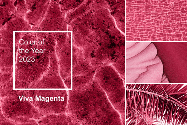
iva Magenta 18-1750: In addition to being Pantone’s “Color of the Year,” Viva Magenta is an empowering and animated one that is expected to maintain its popularity all year long and into 2024, Eiseman said. Viva Magenta might not resonate so quickly for slow adapters, but that doesn’t apply to designer houses like Versace and Balenciaga that have already put it to use. Ditto for musician Sam Smith’s recent elaborate Grammys night ensemble. Lela Rose and Naeem Khan are among the New York-based designer fans of this color.
Red Orange 17-1464: As the most heated tone in the fall lineup, this shade delivers self-assuredness. Just ask Lizzo, who opted for a Red Orange gown and floral-adorned cape from Dolce & Gabbana for this year’s Grammy awards. Another breakout talent, Robert Wun, recently worked Red Orange into his couture collection.
Red Dahlia 19-1555: Deeper and slightly more serious than the other reds on the Pantone roster, Red Dahlia is elegance personified, according to Eiseman. However traditional it might seem, when mixed with some of the more boisterous options it creates a greater contrast, Eiseman said. Iris Van Herpen and Stéphane Rolland took to Red Dahlia in their respective couture collections.
High Visibility 13-0751: Like the sun itself, this hue is a warm one and “absolutely unignorable,” Eiseman said. “While not a neon per se, this is the sun shining at its highest level. It’s the happiest. We felt the need to put in some happy colors to keep the spirits up.” Prabal Gurung put this upbeat yellow to use in the gown he designed for Kelsea Ballerini for the Grammys. Sen. Kyrsten Sinema sported a statement dress in High Visibility that set off a swarm of social media comments at President Biden’s second State of the Union address.
Persian Jewel 17-3934: Inspired by the lapis lazuli mineral stone, this blue is meant to have a cooling effect on the palette’s warmer colors. Glimpses of Persia Jewel could be seen in Harry Styles’ custom Egonlab x Swarovski jumpsuit. From a designer standpoint, Bach Mai and Kent Anthony are also dabbling with Persian Jewel.
Carnival Glass 13-6030: A mentholated green might be akin more to anime than being an obvious choice for the fall fashion season. But Carnival Green can make a statement by itself or in combination with the “hot reds” that Pantone has highlighted this season. Although Carnival Glass is not the easiest color to pull off in a monochromatic look, the Duchess of Cambridge did so with aplomb by wearing a rented Solace London dress at the Earthshot Awards in Boston last month. In the new Saks Fifth Avenue campaign, Emma Roberts shows off hints of the attention-getting hue in one image.
Burnt Sienna 17-1544: “Sturdy and steady,” Burnt Sienna relays a sophisticated earthiness from Eiseman’s viewpoint. Vice President Kamala Harris needs no convincing, since she wore a Christian Siriano ensemble in Burnt Sienna to the State of the Union. AG’s Sam Ku is another designer who has already incorporated Burnt Sienna.
Kohlrabi 14-0255: As part of the yellow greens, Kohlrabi plays into consumers’ interest in environmentalism, nature, wellness, veganism and healthy diets. However sobering that might sound, Kohlrabi is not a serious green, Eiseman said. It’s also not to be missed, as Karlie Kloss has proven, recently wearing a Kohlrabi pantsuit. Aknvas’ Christian Juul Nielsen and Hervé Léger have also used Kohlrabi.
The NYFW New Classics
Coconut Milk 11-0608: Considering that coconut milk consumption is expected to increase to nearly $1.8 billion in the U.S. by 2028, the thirst for this mild white somehow adds up. Familiar as many are with the color of Coconut Milks, this white is easily adaptable since it isn’t stark, Eiseman said. Leading the charge into Coconut Milk are Thom Browne, Chanel’s creative director Virginie Viard and Aelis’ designer Sofia Crociani.
Eclipse 19-3810: Not quite navy, this deep blue is meant to express an air of importance. At last month’s Golden Globes awards, Michelle Yeoh turned up the wattage by wearing an Eclipse-colored Armani Privé strapless gown. “Midnights” maker Taylor Swift seemed to follow that lead with her nearly navy Roberto Cavalli midriff-bearing ensemble at the Grammys Sunday night.
Doe 16-1333: A tawny and tactile brown, Doe is interchangeable, which is a selling point for scores of designers. Demi Lovato recently turned up at Stella McCartney’s party in Los Angeles wearig a jacket in Doe. Look for Doe in the upcoming collections from Robert Rodriguez’s Koltson label and LoveShackFancy’s Rebecca Hessel Cohen.
Hot Fudge 19-0913: Like its homonym Sunday, just mention of the word sundae offers a certain delight and this finishing touch does the same with fashion. Knowing that deep brown doesn’t have the same bite, Pantone has dressed up this tone to give it a stronger presence. Brown might not be the favorite color for some, but often their boots, handbags, flooring or furniture are brown. “We don’t think of brown as such a ubiquitous color until we start to point out how brown is and can be used as a classic for years. If we can just attach our minds to how it is used in beautiful leather goods and wood patinas, brown can be seen as quite gorgeous,” Eiseman said. “This Hot Fudge is the perfect name for it.” Designer Marc Jacobs needs no tempting, nor does the Scandinavian brand Remain, which showed a Hot Fudge trench on its runway.
Silver Birch 13-4403: What would a fall palette be without a dash of gray? While this one isn’t standard material for the corporate world, like all grays it is meant to stand the test of time. With a silvery undertone, it is a red-friendly option, as well as pretty much every other color on the fall list, according to Eiseman. Fendi’s Kim Jones and Mason Chraibi’s Sara Chraïbi are a few designers who have used Silver Birch in their collections.
—
Photo Credit: Kira_Yan / Shutterstock.com