Want to ditch your doldrums at home? Color your world. Face it, grey makes you sad, and on top of that, it’s O-U-T in the interior design world. Warmer neutrals and bright colors dominate every home show this year. Some attribute this need to making your home a softer, cozier haven of relaxation as a reaction to the stress and strife we are having to face more and more in the outside world. The Danish concept of “Hygge” – being cozy and content – has become increasingly popular, and extends beyond walls and floors to softer textures and warmer colors in furniture, pillows, blankets and window treatments.
“It is no surprise that in recent times of uncertainties in the world, we are all starting to favour comforting shads and warming colors in the home.” – Anna Starmer , author of Love Color: Choosing Colors to Live With. “Neutral and natural colours now need to be soft and warm like a favourite cashmere sweater, or the color of a baby deer,” Starmer says, pointing out that people are being drawn to natural settings and that wood, real stones and ceramic pieces are easy ways to “counteract our very unnatural lifestyles.”
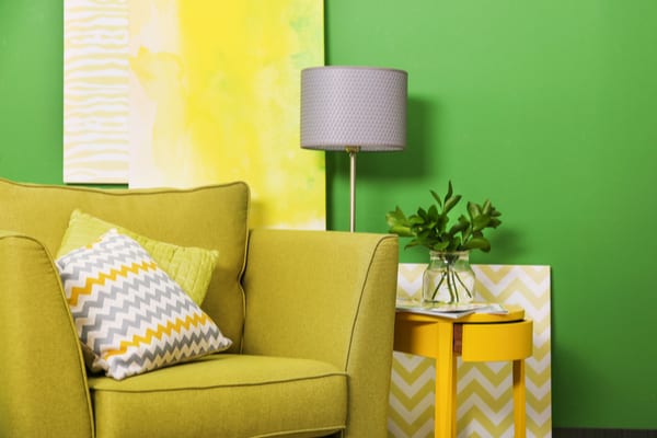
Or if you want to brighten things up, be bold. Go for jewel tones and contrasting colors like blue and orange, and apparently interior designers are in love with the bright inviting nature feel of a lively green, and don’t be afraid to layer! “I love doing paint techniques, and I love wall coverings too, but some people are really petrified of wall coverings, “says Tania Nayak , interior designer and HGTV star. You can do things by painting an accent wall, layering throw blankets or pillows in bright, contrasting colors to create a new focal point in the room.
Whatever colorific trend you decide to go with, experts warn to keep texture and light in mind any time you select a color for a space. “A shade of emerald may look fabulous on a velvet-covered chair, but hideous on the wall of a bathroom,” says Starmer.
—
Photo Credit: Africa Studio / Shutterstock.com