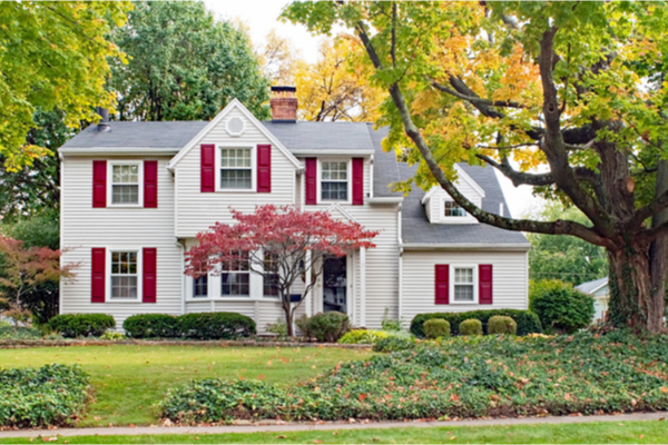
When thinking about curb appeal, most people focus on things like landscaping, paint colors, or installing a new mailbox. But, one overlooked detail may be ruining your look – mismatched window treatments.
You may be wondering – But do I have to make all my windows match so my home looks good from the outside, rather than coordinating with the decor inside each room? The experts at blinds.com have broken it down to help you create the best curb appeal with your window coverings, while making the inside feel comfy and cozy, too.
1. White to the Street
If you’re not sure where to start when choosing window treatments, there is one rule that won’t lead you wrong – go white to the street side. Many homeowner’s associations require that all street-facing window treatments be white, and for good reason. This is an easy way to avoid the mismatched, “Skittles” look. You can achieve this by choosing an all-white window treatment or fabric shades or shutters with a white lining or reverse color.
Note: Adding a lining to fabric window treatments is a good rule beyond curb appeal as it protects the main fabric from sun damage and gives your treatment a more high-end weight. The exception to this rule is some sheer woven wood shades and sheer curtains which need to be unlined to allow light in.
If you want to mix up window treatment styles between rooms, (see tip 3) keeping them all white on the back will still give your exterior some uniformity.
White to the street options:
- White painted Faux Wood Blinds
- White painted Wood Blinds
- White painted Shutters
- Roller Shades with a white reverse color
- Roman Shades with white liner
- Woven Wood Shades with white liner
- Draperies with white liner
- Cellular Shades with a white reverse color
- Sheer Shades in White
- Pleated Shades in white or with white liner
2. Choose Matching Treatments
If you’re not too fussy about your decor, make choosing window treatments easy and pick one matching style for the whole house. Or at least for all of the windows that face the street. A variation of this can be to match the treatments by floor. An example would be curtains or drapes for the first floor and wood blinds for the second floor, all in white.
3. Hack a Matching Look
If you do want to give each room a unique window treatment to suit its decor, there are a few ways you can achieve this without losing uniformity to the street.
- Match base treatments for all windows (roman shades, roller shades, shutters, white wood blinds) and mix up the style inside with unique curtains or draperies for each room. (See image above.)
- Choose one treatment style for all windows with white lining and change the inside facing fabric. For example, white lined roman shades in a different fabric for every room.
4. Keep Positions Uniform
An extra touch to make your home look symmetrical and visually pleasing is to match the position of all treatments across the front of your house. For example, all shades lowered to halfway, all drapes pulled back to the same position, or all shutters tilted open halfway. If one window is different from the rest, it’ll stick out. Of course, you can adjust your treatments inside as needed, but it’s good to go through the house and “reset” the look to your regular positioning once per week or so. Some of you may not be committed enough to maintain this look all the time, but it can be good to remember if you’re photographing your house or want to give your home a nice look for a party or event.
5. Coordinate With Other Exterior Features
There are a few exceptions to the white-to-the-street rule. Some customers with wood exteriors, like a log cabin or rustic-style home, don’t want blocks of white standing out in their facade. In that case, the experts recommend wood blinds, faux wood blinds or plantation shutters in a stain that matches your woodwork. Be sure to order free samples to be sure the stain doesn’t clash.
Wood treatments can also be a better choice for homes with stained wood or oil-rubbed bronze windows. (See above) White treatments can make dark mullions stand out in a way that some people prefer to avoid. Other homeowners want treatments that coordinate with the tones of their brick, siding, exterior shutters or a stained door. For anyone choosing a non-white street facing look, experts say you should to stick to wood tones that coordinate with the house, or choosing a light colored neutral like tan or grey.
—
Photo Credit: Susan Law Cain / Shutterstock.com
