DIY decorators often get the furniture plan right and nail the neutrals but then cringe like the Cowardly Lion when choosing color. Afraid of making a mistake, we default to neutrals and maybe one accent color. The result? Safe and boring interiors.
As the Mercury News reports, here’s a page from the designers’ color-courage handbook: When combining colors, remember to follow the guidance of your simple color wheel: opposites attract.
Remember the color wheel from grade school, that round rainbow that radiated all the colors? We learned how the primary colors — red, blue and yellow — mixed to form secondary colors— orange, violet and green — and hybrids, like red-orange and yellow-green. We learned that colors can be warm or cool, they can calm or energize, and that colors on the opposite sides of the color wheel can complement each other.
Maybe you jumped on the color train right away, or maybe you were well into adulthood before you figured out what the big complementary fuss was about, to discover that indeed, if you want to create rooms that cohere color-wise you need complementary colors to collide. Designers know that, and now you do, too, if you want to take a room from ho-hum to fabulous, you need to inject opposite colors.
Blue is the zig to orange’s zag. Yellow is the yin to purple’s yang.
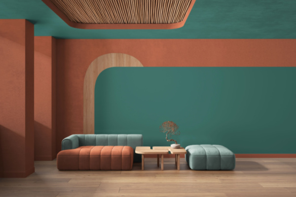
But wait, you say, you don’t like red and green together, except on elves. Purple with yellow is gaudy, and blue next to orange only works for sports teams. Those points are valid, but colors come in many variants, and reds range from deepest burgundy to palest pink. So, rather than picturing cherry red and leprechaun green, imagine an emerald velvet loveseat set against a ballet-slipper-pink wall, or celery-green tweed chairs in front of a red brick hearth. Imagine an eggplant leather chair alongside linen drapes the color of butter, and pale aqua towels displayed against a coral wall. You get the idea.
Complementary colors work together because — without getting too scientific — spectrum-wise, they each have what the other is missing. To paraphrase “Jerry Maguire,” they complete each other. Complementary colors work because they bring out the best in each other. Blue makes orange feel more orange. Flower lovers know that yellow enlivens violet. Together, they create what designers call visual tension, a good kind of tension, the way a riveting plot holds a book together or suspense binds a movie.
All that is to say, if you want to kick your home décor up a notch, use colors that live across from each other on the color wheel. According to Marni Jameson, author of seven books, including the recent “Rightsize Today to Create Your Best Life Tomorrow,” here’s how you do it:
Consult the color wheel. If your rooms are boring, and you’re not sure why, look at the colors in each room. Identify the neutrals — the creams, whites, browns, grays and tans — then see what’s left. Maybe nothing? Maybe one main accent color in varying shades? Maybe a discordant jumble? Now revisit the room’s color scheme. Choose one accent color to emphasize, say teal, then look across the color wheel and consider adding a touch of its opposite, like pumpkin or apricot.
Be open-minded. Consider the range of shades that belong to each color, from the deepest version to its most hushed tone. Each shade can work harmoniously with a partner color of any intensity on the other side.
Avoid the 50/50 split. You don’t want to represent colors equally. The 60-30-10 design rule is a good one. Have 60 percent of your room a neutral color like sand, 30 percent a secondary color like plum, and 10 percent a complementary accent like mustard yellow.
Go beyond throw pillows. While accent pillows are a great way to add color, consider adding color with rugs, art, upholstery, accessories or drapery.
You can still be cool. Although pairing opposites always means mixing warm and cool colors, you can still have a room that feels predominantly cool or warm. A calm bedroom decorated in shades of mint and eucalyptus, for instance, can benefit from a splash of salmon or terracotta. Conversely, you can have a sunny yellow kitchen accented with touches of periwinkle and still have a warm ambience.
Say it with flowers. One of my favorite ways to inject a complementary color in a room is with a simple bunch of single-color flowers, orange tulips in a pale blue bedroom, say, or pink roses in a hunter green study.
—
Photo Credit: Archi_Viz / Shutterstock.com