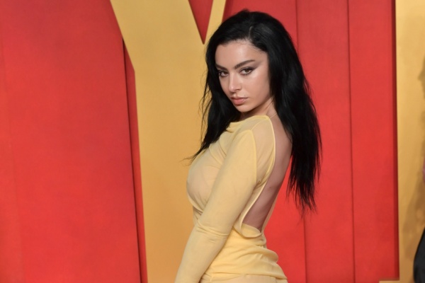
In case you haven’t caught the Charli XCX fever that’s been sweeping social media, let me be the first to inform you: it’s the summer of Charli XCX. Her album “Brat,” with its lime green cover and sans serif font, has become an instant icon, especially on TikTok. Even the New York City MTA has joined in on the fun, showcasing the meme-ified album art.
While it might look like Charli whipped up the cover in MS Paint in 30 seconds (which, let’s be honest, would be totally on-brand and awesome), the inspiration behind it is far more complex. In a recent Billboard interview, Charli and her creative director, Imogene Strauss, revealed the meticulous process behind the album cover. Interestingly, the cover concept existed before any songs were written. On March 16, 2022, Charli texted her friends, “I think it should just be one word on the album cover… Maybe it should be called ‘Brat.'”
Charli didn’t start writing the album until six months later in Mexico City, using the title as a muse for the attitude and vibe she wanted in her music. When it came to the visual aspect, Charli drew inspiration from “a 1990s neon rave flyer and the title credits to Gregg Araki’s 2007 comedy, Smiley Face.” She chose Pantone 3570-C for the cover, describing it as “actually quite disgusting” because it sparks an interesting conversation about desirability. She wanted the color to be “unfriendly and uncool.”
Despite its intended repulsion, the neon hue has ironically become the coolest color of the summer. The meme-ification of the cover was a strategic move; Strauss mentioned that the team went through hundreds of versions until they found one loud enough to stand out in stores.
So, as we dive deeper into this Charli-fied summer, it’s clear that the “Brat” era is more than just an album release — it’s a cultural moment, a testament to Charli XCX’s unique ability to blend high art with pop accessibility.
—
Photo Credit: Featureflash Photo Agency / Shutterstock.com
